

Storybookを業務で触っていたのですが、部分的で体系的に学習していなかったので有給期間で時間がありチャンスなので改めてStorybookを触ってみました。
せっかくなので、実際に運用している知人のWebサイトにStorybookを導入してみようと思います。
👇はフロントはNext.jsでCMSにWordPressを使っています。ホスティングはNetlifyです。
2年ほど前に構築したのですが、小さいWebサイトかつほぼ自分一人での構築だったのでStorybookの導入とかはしていません。

今回の対象
今回はButtonのコンポーネントに対して、Storybookを導入していこうと思います
type Props = {
  buttonColor?: string
  children: React.ReactNode
  href?: string
}

export function Button({ buttonColor = 'bg-black', children, href }: Props) {
  return (
    <a
      className={`inline-block w-full max-w-xs whitespace-nowrap rounded-full px-10 py-3 text-center text-white ${buttonColor}`}
      href={href}
    >
      {children}
    </a>
  )
}
Storybookの導入
とりあえず公式を見てみるとStorybook for Next.js with ViteとStorybook for Next.js with Webpackがあるようです。
StorybookのビルドにViteかWebpackどちらを使うかということのようです。
下記のようにあったのでViteを使うことにしました。早いしモダンだぜということみたいです。
We recommend using
@storybook/nextjs-vitefor most Next.js projects. The Vite-based framework is faster, more modern, and offers better support for testing features.Use this Webpack-based framework (
@storybook/nextjs) only if:
- Your project has custom Webpack configurations that are incompatible with Vite
- Your project has custom Babel configurations that require Webpack
- You need specific Webpack features not available in Vite
$npm create storybook@latestいくつか質問(オススメの設定でいいか、Playwrightを入れるかなど)聞かれるのですが、とりあえず全ておすすめされる方で対応しました。
いくつかファイルが更新されていたり、新規で作成されています。いくつか確認しておきます。
.storybookmain.ts- Storybook のメイン設定ファイルです。
- どの stories を読み込むか
- 使用するアドオン
- フレームワーク(Next.js + Webpack など)
- といった、Storybook 全体の挙動を定義します。
preview.ts- Storybook 上で表示される 全 Story 共通の設定 を行うファイルです。
- グローバルな CSS の読み込み
- decorator の定義
- parameters(背景色、レイアウトなど)
- 「実際の Next.js 画面に近づける」ための調整はここで行うことが多いです。
vitest.setup.ts- Storybook で Vitest を使ったテストを行うための初期設定ファイルです。
- グローバルな mock
@testing-library/jest-domの設定
stories- Storybook の サンプル用 Story が置かれるディレクトリです。
- 実運用では、同じコンポーネントディレクトリに置くことが多いと思うのでこのディレクトリは後ほど削除することになります
vitest.config.ts- Vitest 用の設定ファイル
- テスト環境の指定
- setup ファイルの読み込み
- エイリアス設定
- Storybook の Interaction Test を使う場合に参照されます。
vitest.shims.d.ts- Vitest 関連の 型定義を TypeScript に認識させるためのファイルです。
describeitexpect- などのグローバル関数を型エラーなく使えるようにします。
package.jsonも更新されていてStorybookが動かすためのスクリプトが追加されていました。
  "scripts": {
    "dev": "next dev --turbopack",
    "build": "next build",
    "start": "next start",
    "lint": "next lint",
+   "fix:lint": "next lint --fix",
+   "storybook": "storybook dev -p 6006",
+   "build-storybook": "storybook build"
  },
とりあえずstorybookを立ち上げてみる
$ pnpm run storybook

 storybook v10.1.9
│
●  Starting...
│ ╭──────────────────────────────────────────────────────╮
│ │   Storybook ready!                                   │
│ │                                                      │
│ │   - Local:             http://localhost:6006/        │
│ │   - On your network:   http://10.18.250.154:6006/    │
│ ╰──────────────────────────────────────────────────────╯
│
●  218 ms for manager and 2.88 s for preview
Browserslist: browsers data (caniuse-lite) is 12 months old. Please run:
  npx update-browserslist-db@latest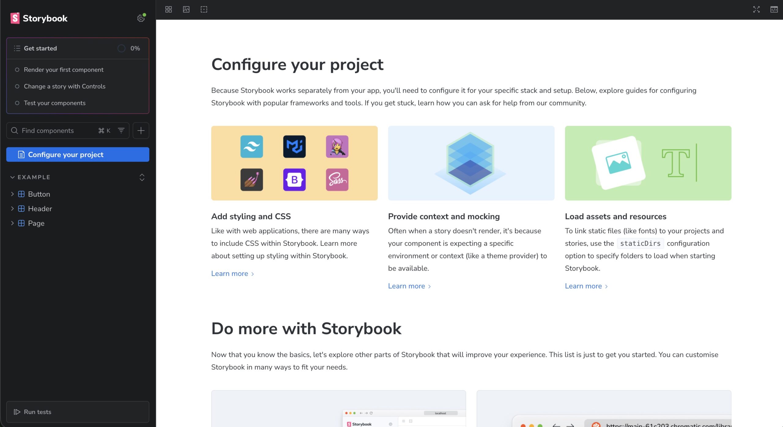
Why you should do it regularly: https://github.com/browserslist/update-db#readmehttp://localhost:6006/?path=/docs/configure-your-project--docsで👇の画面が立ち上がると思います!
これでセットアップは完了です。結構簡単でしたね。
プロジェクトで使っているコンポーネントに対してStorybookを作成する
先ほど立ち上げた環境で確認できるStorybookのコンポーネントはサンプルのものなので、自作のコンポーネントに対してStorybookを作成します。
下記のような構造になっているのですがstorybookディレクトリは削除して、components/ui/Buttionのディレクトリの中に新規ファイルButton.stories.tsxを作成します。
/
├─ .storybook
│  ├─ main.ts
│  ├─ preview.ts
│  └─ vitest.setup.ts
├─ components
│  ├─ base
│  ├─ pages
│  └─ ui
│     ├─ Button
│     │  ├─ index.tsx
│     │  └─ Button.stories.tsx
│     └─ SectinoTitle
└─ storybookButton/index.tsxの中身はこちらです
Button.stories.tsxの中には最小のコードでまずは進めます。
import { Button } from './index'
export default {
component: Button,
}
export const Default = {
args: {
children: 'Click me',
},
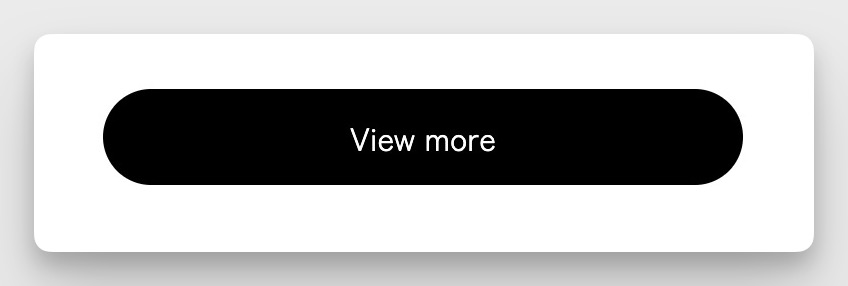
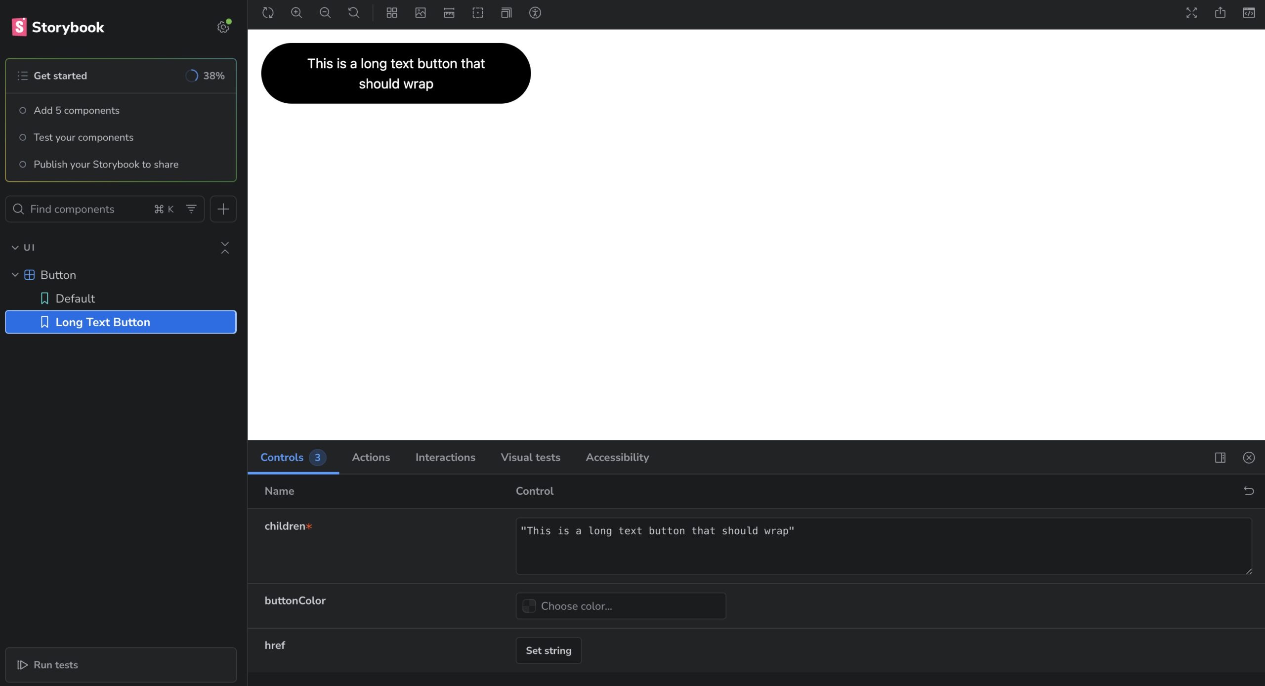
}ボタンでよくある長いテキストが入った時に表示状態をStoryとして作ってみます。
export const LongTextButton = {
  args: {
    children: 'This is a long text button that should wrap',
  },
}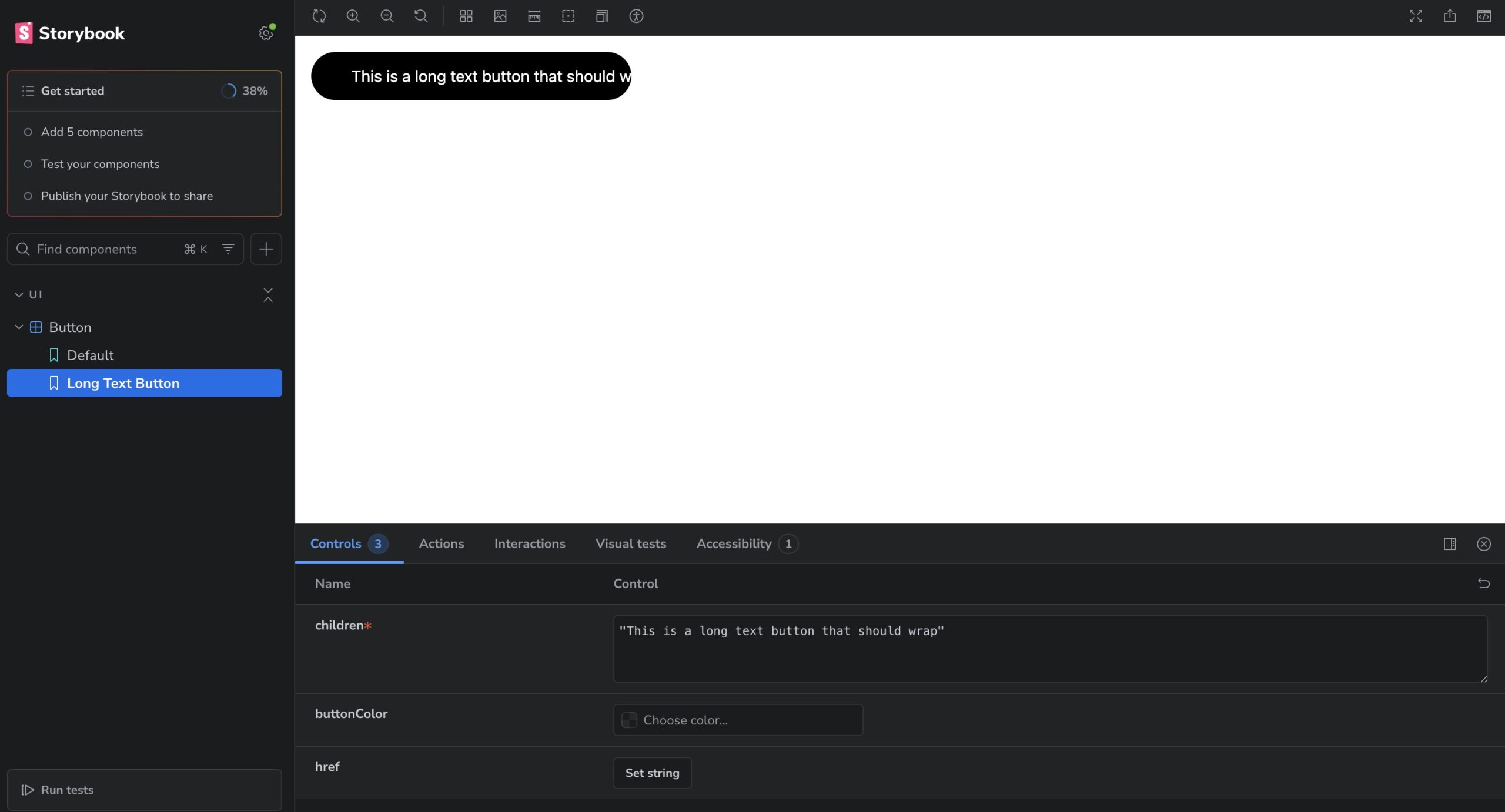
あまりよくない実装になっておりましたね。文字数が増えた時の表示は事前にデザイナーとすり合わせをして決めておくといいですね。今回はTailwindにあてるCSSを調整して対応をしました。whitespace-nowrapを削除しました。
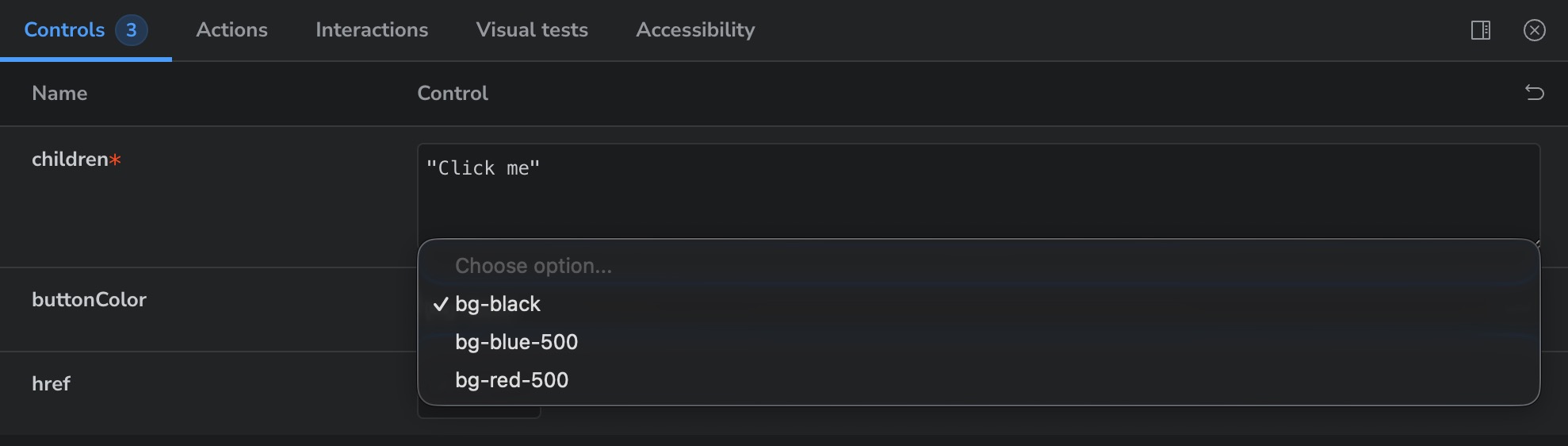
buttonColorをStringからUnion型に変更
Storybookの問題というよりもそもそもの実装が微妙そうなのでコンポーネントの修正を行います。
いまだとStringでbuttonColorを変更できてしまうので、サイト内で使用できる色だけに縛ります。
type Props = {
- buttonColor?: string
+ buttonColor?: 'bg-black' | 'bg-blue-500' | 'bg-red-500'
  children: React.ReactNode
  href?: string
}
argTypesを使ってControlsカスタマイズする
Storyファイル側で argTypes を設定すると、カラーピッカーを表示させたり、特定のプロパティを非表示にしたりできます。
export default {
  argTypes: {
    buttonColor: {
      control: 'select',
    },
    href: {
      control: 'text',
    },
  },
  component: Button,
}
Decoratorsでレイアウトを調整する
ボタン単体だと画面の左上に張り付いて見づらいことがあります。decorators を使うと、すべてのストーリーを中央寄せにするなどの共通レイアウトを適用できます。
export default {
  argTypes: {
    buttonColor: {
      control: 'select',
    },
    href: {
      control: 'text',
    },
  },
  component: Button,
  decorators: [
    ((Story) => (
      <div className='flex min-h-screen items-center justify-center p-4'>
        <Story />
      </div>
    )) as Decorator,
  ],
}
まとめ
日々開発をしていると少し違うけどかなり酷似したコンポーネントを再開発してしまったりすることがあります。
Storybookを使ってコンポーネントをカタログとして見れるようにしておくとそのようなリスクも減らすことができますので特にチーム開発では積極的に使っていけるといいですね。